System Preferences in macOS, Sierra: General

eXtensions - Tuesday 4 October 2016
|
System Preferences in macOS, Sierra: General |
 |
|
|
By Graham K. Rogers

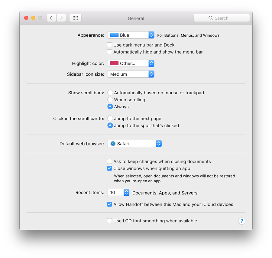
Immediately below this button is a checkbox marked, "Use dark menu bar and Dock" which changes the normal white menubar to black (with white text and icons). This was new in Yosemite. The Dock has a dark grey finish when this feature is selected and the black spots beneath an open application change to white. Below this is a new checkbox marked "Automatically hide and show the menubar". When this is selected, the menubar disappears when not in use, giving a completely clear working screen. When the cursor is moved towards the top of the screen, the menubar appears, disappearing again when the cursor is moved away. Despite the usefulness of a clear screen, this feature might not suit all users.
Below is a button that first appeared in Mountain Lion (10.8): Sidebar icon size (Small, Medium, Large). This makes a significant difference to the icon size in the Finder sidebar. Those with specific needs may find this useful. The change is made instantly. In early versions of Sierra, the Small setting caused a display problem on my MacBook Pro with the icons not matching the text: Feedback was posted to Apple.
There are three radio button options for showing scroll bars:
Below these controls are two items that control where the content moves to when the scrollbar is clicked:
Text below reads, "When selected, open documents and windows will not be restored when you re-open an app". This may save the frustration of wading through several windows when all that is wanted is to open a new document. The Recent Items option in the Apple menu is controlled by a button below those checkboxes. The single button works for Documents, Apps and Servers, allowing from 5 - 50, plus None to be shown in that menu as before. Recent Items in the Apple menu (top left of the screen) assists a user with a swift way to re-open a program or file. The Servers item allows a quick reconnection to a network connected disk or computer. At the bottom of the recent Items menu is an option to Clear Menu. When accessing the menu, pressing the Command key adds the option to "Show" a specific item in the Finder (not Servers). Below this is a checkbox that allows use of the Handoff feature: users of macOS and iOS can start a task (such as viewing a browser page) on one device and then pick this up on another.
See Also:
Graham K. Rogers teaches at the Faculty of Engineering, Mahidol University in Thailand. He wrote in the Bangkok Post, Database supplement on IT subjects. For the last seven years of Database he wrote a column on Apple and Macs. He is now continuing that in the Bangkok Post supplement, Life. He can be followed on Twitter (@extensions_th) |
|

For further information, e-mail to

|

|