eXtensions - Saturday 1 October 2016


System Preferences in macOS, Sierra: Dock

apple and chopsticks


advertisement


By Graham K. Rogers


Some of the panels in System Preferences remain unchanged in the update to macOS, Sierra. The Dock preferences panel is for settings that affect operations of the Dock and its appearance. The interface design appears unchanged from before although there are two changes on the panel itself.


The Dock is the bar of icons that sits at the bottom or side of your screen. It provides easy access to many of the apps that come with your Mac (like Mail, Safari, and Messages). You can add your own apps, documents and folders to the Dock, too (Apple Support document HT201730).

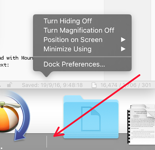
With Sierra, the single panel appears initially to have the same settings as it had in earlier versions of OS X. It provides ways to make adjustments to the Dock feature. In those earlier versions, some changes were made directly in the Dock by clicking on the divider line (towards the right side) and using the Control key. This is still possible. The divider is slightly more visible than before.

The divider line is located between the apps and folders/documents in the Dock. As the cursor nears the spot between the two parts, a double vertical arrow will appear: clicking on the line while pressing the Control key brings up a menu. Both the Dock and the menu appear different if the user has selected "Use dark menu bar and Dock" in the General preferences panel.

Dock


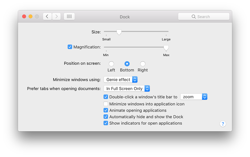
Near the top of the preferences panel is a slider marked Size (Small to Large). Below this is a check box for Magnification. When this is selected, the adjacent slider (Min to Max) can increase or decrease the level of magnification of app icons in the Dock.

Three radio buttons are provided in the middle of the panel to position the Dock on the screen. The default is Bottom. Also available are Left or Right. Users who access tools at the bottom of a screen in an application (e.g. Final Cut Pro) may prefer the Dock to be positioned to one side.

A button below these three selectors is available to decide the effect used when a Window is minimized. The default is Genie effect, which makes a file appear to shrink as if it were going into a bottle-neck. The reverse happens when it is clicked in the Dock and becomes large again. The Scale effect uses less processing power and as the panel becomes smaller, the width and height are in proportion. Both effects may be slowed by pressing the Shift key at the same time.
Dock


Below the Minimize button is a new feature: a button marked "Prefer tabs when opening documents". This has three options: In Full Screen Only (default), Always, and Manually.

The bottom of the panel has the same 5 checkboxes it had with Mountain Lion although the last of these has a small change to the text:

  • Double-click a window's title bar. This is now controlled by a button that is live when the box is checked. There are now two options: zoom and minimize (the previous default). As soon as this box is checked, the feature becomes available: no restarting is needed.

  • Minimize windows into application icon. With this checked, when a file is minimized it is not visible on the Dock as a separate file. When the application icon in the Dock is clicked, a list of files related to the application are shown. A minimized file is marked with a diamond.

  • Animate opening applications. When checked, an application that is started (whether permanently in the Dock or not) will bounce a number of times while opening. When unchecked, the icon remains still.

  • Automatically hide and show the Dock. When checked, the Dock appears from the bottom (or sides, if so located) as the cursor is moved near the edge of the screen. When this is unchecked, the Dock is visible at all times.

  • Show indicators for open applications. When an application is active, a small spot appears below the Dock icon (black by default, white when dark menus are used). When this is unchecked there is no indication in the Dock.


See Also:


Graham K. Rogers teaches at the Faculty of Engineering, Mahidol University in Thailand. He wrote in the Bangkok Post, Database supplement on IT subjects. For the last seven years of Database he wrote a column on Apple and Macs. He is now continuing that in the Bangkok Post supplement, Life. He can be followed on Twitter (@extensions_th)


advertisement


Google


Made on Mac

For further information, e-mail to

information Tag information Tag

Back to eXtensions
Back to Home Page