|
By Graham K. Rogers

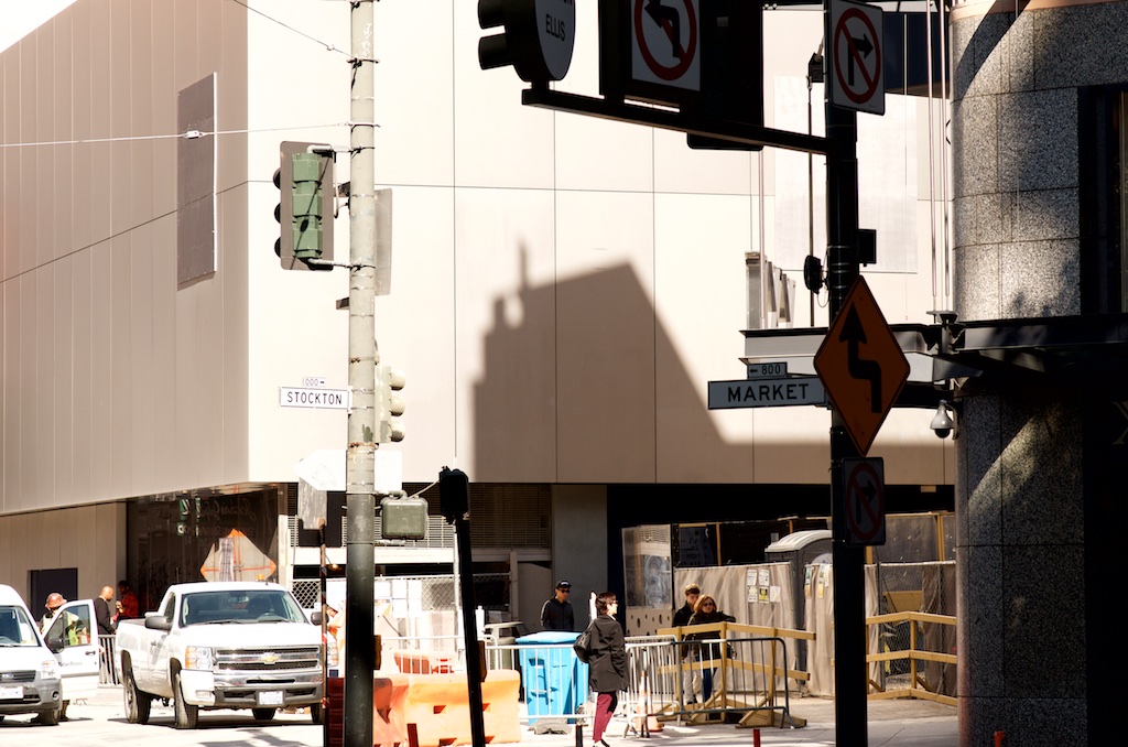
Apple's famous Stockton Street shop in San Francisco closed its doors not so long ago and is currently being demolished. The new store in Union Square opened on May 21 this year. Its design has incorporated many of the lessons learned from Apple's years in retail. The stores are now being pushed as consumer-friendly, community-oriented places.

Apple's former Stockton Street store undergoing demolition
We need to remind ourselves that Apple's move into retail was seen as risky by many, but the naysayers failed to take into account the preparations that went into the style of the shops and what went on in them, like the Genius Bar.
It is interesting to compare the approach taken by Apple to the stores with this week's presentation on WatchOS 3. Some are looking at the Fall update to WatchOS as an admission of failure that the Apple Watch as originally released was not ready. Listening to Kevin Lynch explaining the new features of WatchOS 3, I noted that this update solves some of the user needs that could not have been foreseen.
Remember too that the iPhone and iPad developed in ways Apple had not fully anticipated because of user feedback and developers responding to new APIs. This is happening in the stores, as the designers respond to feedback from staff and customers.
A simple example is the Genius Bar - a hallmark of the Apple Store. The counter may be seen as confrontational, particularly when the customer is stressed, such as when there is a critical computer problem. The customer and genius can now work side by side: at a table, or even sitting on the leather surrounds of the ficus tree planters.

Union Square
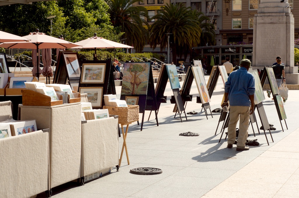
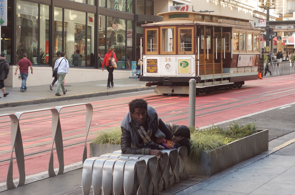
On our way to Union Square, we walked past the old store which was undergoing demolotion. The few hundred metres to the new store reminded me of why I like San Francisco with its multi-ethnic character - its mix of old and new - along with the use of streets for performance and Art. There is also a darker side with many unemployed.

Good and not so good in San Francisco streets
That original Stockton Street store opened in 2004 and had 100 staff. Over the years, Apple reports that it welcomed over 20 million customers. The Union Square store has more than 350 staff and a major intention with the new design (by Foster and Partners) is to grow a sense of community, which is part of the reason Union Square was chosen: the area has many events throughout the year.
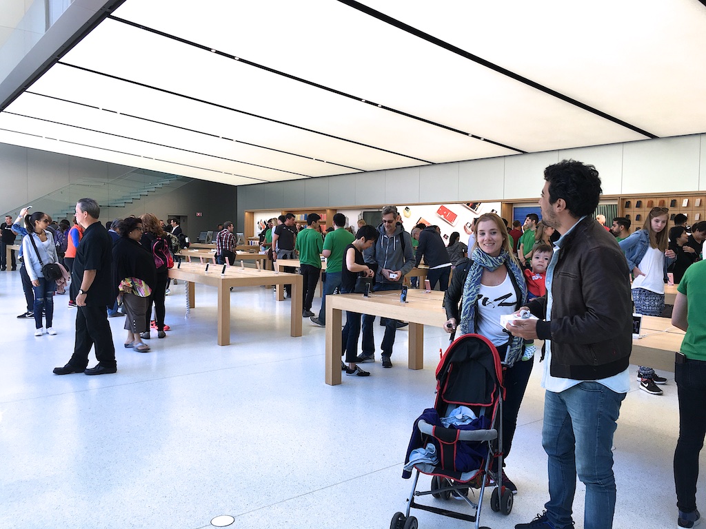
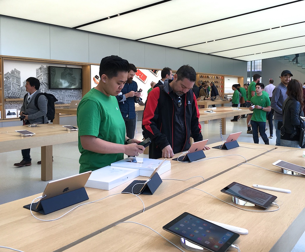
The store feels open, but the warm colors, particularly with the wood selected, are welcoming, as are the staff. I had a couple of queries while I was there and these were answered quickly and in a friendly manner. A couple of times, when I may have looked as if I was interested in a particular product, I was offered help, but the member of staff backed away discreetly when I declined the offer.

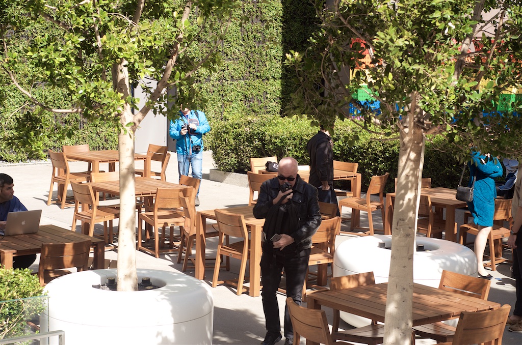
The new store has retained some of the elements of earlier Apple stores which have evolved, particularly after the arrival of the iPhone. The concept of the town hall or community center figures strongly here, particularly with Union Square in front and a small garden behind. Apple has retained and restored a fountain that was in the garden and provided furniture so that people have a place to relax.

Garden at the rear of the Union Square Apple Store
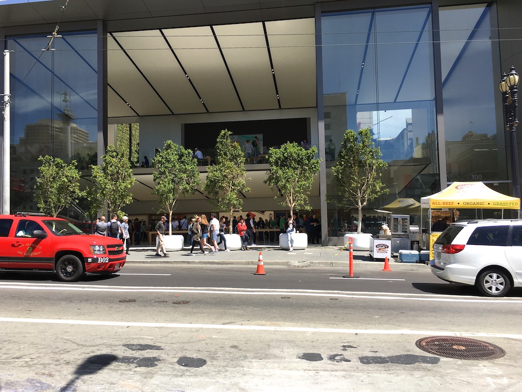
The doors to the garden can be fully opened, as can the massive doors at the front of the store, so there is direct contact with the store from outside. Those doors each weigh about 20 tons and are some 42 feet high (12.8m): the largest such doors in the world, we hear.
When open, not only is there direct contact with the outside, but this aids cooling in the store: with many people visiting, temperatures will rise. The cooling is assisted by water-filled tubes beneath the floor.
50 Kw of power used in the store is provided by 6500 sq/ft of walkable glass panels. The glass facade is made of four layers of laminated glass. The back facade is three layers of laminated glass. The glass balustrade of the staircase is five layers of laminated glass.

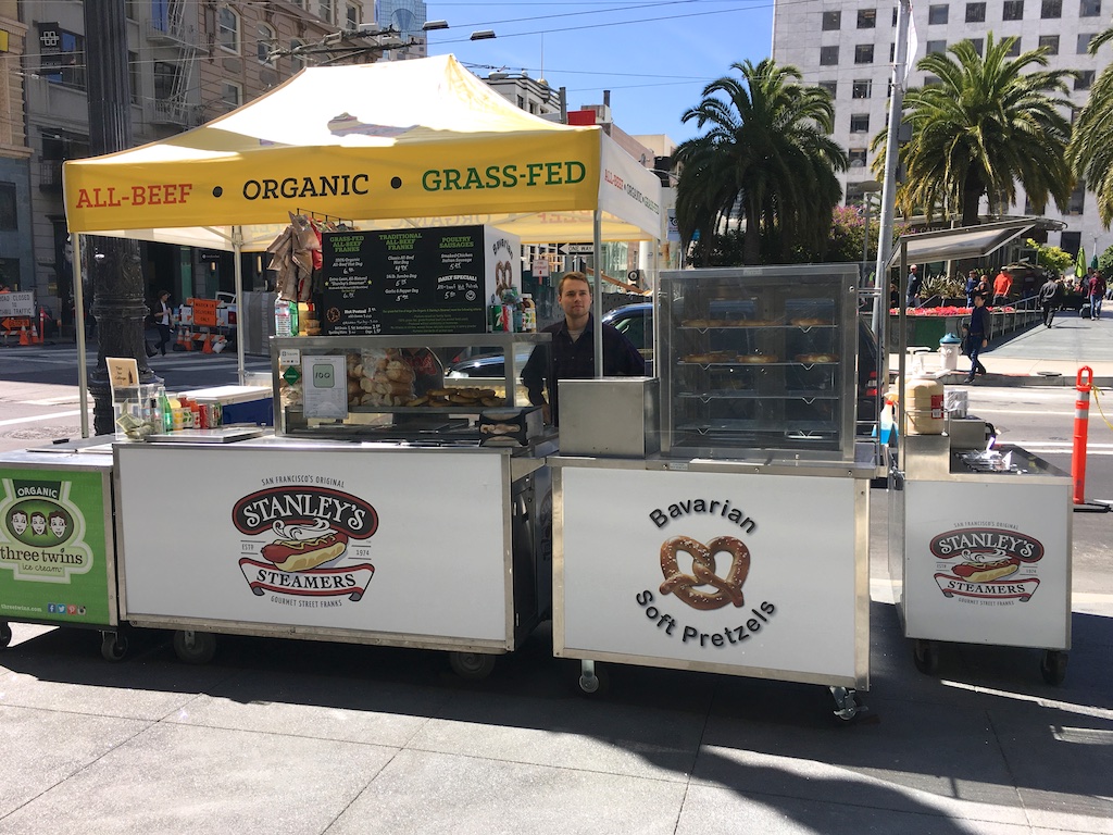
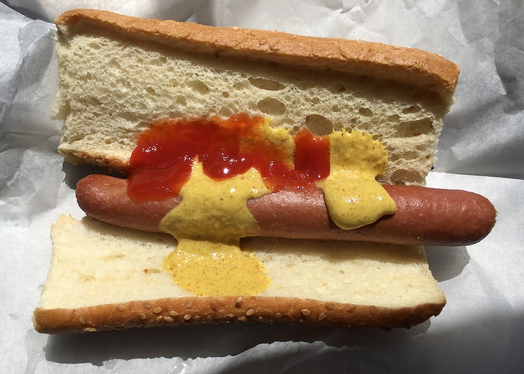
Just outside the store is a hot dog stall. I had seen this mentioned online, but it was not clear if there was any location conflict: small operator/multinational corporation. That stall has been there for 41 years and is part of the community. When I asked if Apple had put any pressure on them to move, the young lady said that, on the contrary, they encouraged them: good neighbours.

Frequent events are held in the store: Photo Walk, Creative Sessions, live music. The second floor area is dedicated to these programs called "Today at Apple". When I was there, VSCO was running one of its Creative Sessions. The area is equipped with tables for working and cube stools for group sessions. There are also demonstrations of devices, software, teaching, art and other types of interactivity. This Saturday (18 June 2016), the artist Josh Cochran would hold a live art demonstration of murals and then teach.
I saw a small session being held at one of the large tables nearby. A movable display was in use so that participants might see the processes more easily. An hour or so later, an artist was using an iPad to draw, with output being displayed on the massive 35' (10.67m), 6K screen that dominates one part of the second floor.
Genius Grove and potential future genius
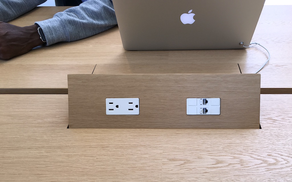
Behind the screen - facing the garden - is the Genius Grove. There are several trees in planters and the ceiling is high. Both are part of the effort to create a calming environment. Adjustable lighting adds to this. Those planters are Apple-designed and have glass reinforced concrete sides with leather seating. There are also tables - of Spessart Oak - provided here and these have popup power outlets (and Ethernet connectors).

The power outlets are so interesting, but I was told they do break sometimes as kids tend to play with them a lot. The trick was to slide the hand gentle towards the panel on its left side. The same movement would close it.
Power Outlets - Swipe from the Left
While in the store, I bought a LaCie Porsche 2TB, USB 3 disk. The transaction was done using an iPhone, which also opened the cash drawer (a proximity sensor). The staff member took my email address and a receipt was sent to me almost immediately.
There was no counter, no cash register, no lining up, so the transaction was relaxed. The customer-staff interaction has been rethought so that I felt in control the whole time, unlike in some stores where the entire payment process is a series of confrontations.

Open approach in the Apple Store
The store is set out to reflect what Apple calls, The Avenue, which was designed to be immersive, engaging and creative. The intention was to create an atmosphere like a shopping street inside a store. The displays are changed frequently so that customers feel there is something new each time they come in.
Colors of the products on display are changed, depending on the season. Those visiting the store can try different combinations of products, including covers, to see which suits them best. Customers are also encouraged to try covers on their own devices to ensure that the fit and feel are right.

Union Square Apple Store - Doors open
With devices on floor one - opening to Union Square - accessories are found to the rear of floor two which extends over the ground floor. The cantilever design of the floor means that there are no columns on the lower floor to obstruct the space. The floor tapers from 3' at the rear to a thickness of 6" at the front and movement is damped by hydraulic shock absorbers. On the first floor, the tapering ceiling has been designed to control acoustics and the lighting installed.
Either side of the large space are staircases made up of several layers of glass. Each layer is about 1cm thick. It is rumoured that each step cost $33,000 dollars, but Apple would not talk about the price. Sadly a couple of the steps had cracks.
A section of the stairs and a cracked step
The design elements are expected to be incorporated into new stores and those being upgraded. Stores in other countries may use different materials depending on local availability: some things will be contant; some will depend on changed situations.
Materials: Ballustrade with 5-layers of glass; and the floor
See also:
Graham K. Rogers teaches at the Faculty of Engineering, Mahidol University in Thailand. He wrote in the Bangkok Post, Database supplement on IT subjects. For the last seven years of Database he wrote a column on Apple and Macs. He is now continuing that in the Bangkok Post supplement, Life.
|
