|
|
After the update, I noticed that backing up was far swifter than before: a complaint that many had. The first time it was really slow, which I guess was when it created a new database: after that, hardly noticeable. Once that was done, I checked for any changes to currently installed apps, then checked out what was new.
Seismometer has had considerable improvements and there is now a settings panel that allows considerable fine tuning. There are high- and low-pass filters as well as several frequency settings, from 20Hz to 200Hz. Also added have been alternative scales (logarithmic and Linear) as well as now three different ways to record data with a different axis: Z, Y and Z, or All. Simplest of all additions, but perhaps most useful for observing, is the pause button. A strong reading can be held and a screen shot taken far more easily. The feedback from users is being put to good use here.
I initially thought that the iPod touch might not be suitable for the heavier use that running would bring, but note that Apple has now added the Nike + receiver to the second generation touch, so what do I know? I had earlier tried the Nike + system with some (very comfortable) shoes and the second generation iPod nano and this is not wholly suitable for some sports activities like cycling. Stop Watch might fill part of that gap, but the screen lock would have to be off; and there is also the question of battery use to consider. I am finding that since the apps have arrived, the battery tends to get used up. I am still unsure if this is because of increased consumption or just the way I am using it much more playing with all the apps. Video, which I also view a fair amount, is also a user of power.
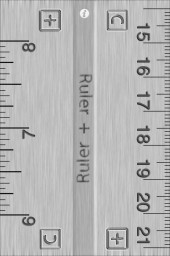
As the screen is long and thin, the ruler only works along the sides and displays centimetres to the right (with the home button at the bottom) and inches to the left. Of course with the size of the iPod, only two full inches can be shown (and 7 centimetres). To get round this, as we move the iPod along to the right, pressing a + button on the screen adds more to the ruler length: to 4", then 6" and 8"; or to 14 cms, then 21 cms and so on. Pressing "C" returns the scale to zero. The accelerometer has no effect on the screen at all so the rulers are always displayed along the same two sides. When examining the information screen, this also is unaffected by the attitude of the screen. How accurate is this? While the developer of Level warned that the app should be no more than a guide (even if after the calibration feature was introduced there was a reasonable accuracy), the screen displays of RulerPlus are accurate enough for most non-engineering purposes. I compared the scales with a metal engineer's ruler and, using my eyes only, could not notice any difference in the screen or (real) ruler. It is, of course, not a ruler, but will be able to produce a fairly close guide to a measurement.
What interested me about PowerGraph was the idea of graphing on such a small device as the iPod, and (always thinking of design) the rather attractive logo. The interface of the app itself did not match up with the external aesthetics. While the calculator seems to have all of the functions, the interace was not sharp and the buttons seem slightly skewed. Surely not part of the design? I also see that the top "entry" button disappears in part off the top of the screen, while there is enough space at the bottom for some readjustment to be made to this interface.
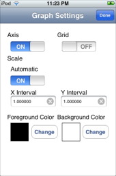
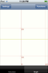
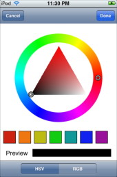
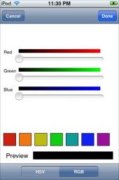
I also found it possible to crash this app by forcing errors or pressing buttons wrongly. For example, if I put in root but no number, and then pressed enter a couple of times, I would be returned to the home screen. For sure, this is using the calculator beyond its normal use, but sometimes a user may enter spurious input. The graphing function needs someone with higher mathematical skills than me to be able to get it to work to its fulest, but it ha a number of screens that make it highly tunable, from the screen settings themselves to the functions. The screen may be changed in the way grid lines are displayed as well as colour settings. There are two ways to change colours: HSV or RGB. The latter has sliders.
When a graph is displayed, the lines on the screen are somewhat fine so need a careful eye to see them clearly. Of course the thinness adds to the accuracy, but may affect the ability to read the results. For someone who is adept at such mathematical skills, this would doubtless be easy to use. For someone like me who wants to have access to such a facility, some instructions might be useful. The information screen is web like and there is a link to the Safari browser and the developer website. The app is currently free but informstion in iTunes tells me that this is only for a limited time.
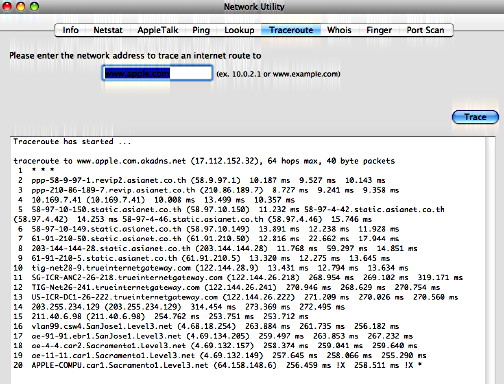
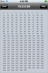
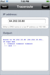
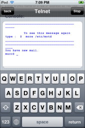
My first surprise came with Network Ping Lite. I downloaded this because of the name and thought that on occasion it would be handy to have such a facility as the internet utility, Ping, so that it would be avialable if ever I needed to check a connection. It was a bit late for me actually, as a couple of days before I found it, the office network was having one of its bad hair days, so my technician suggested another wifi router. That was a bit slow in being identified and I was sitting waiting: Ping would have been perfect. What Ifound when I opened the app was not one, but four utilities: ping, Ping subnet, traceroute and Telnet: some of the tools someone might need for some basic hacking if connected to a network. Ping works fine. Enter a URL or an IP number and away it goes just like its Unix big brother. Likewise, the section Ping Subnet, which someone in my department called a scanner, examines the router IP and looks for any devices connected to the router. The screen is a table with ten columns of numbers (black on white) from 0 to 255 and if any of these numbers are found to be in use, it changes from black to green. It did not find my MacBookPro which I have hidden behind Apple's extra strong firewire provisions (use the Advanced button), but the router, the iMac and the iPod touch numbers were identified.
With each of the functions, a user is required to enter either a text or numberical strong into a standard panel then link to the network or internet. What I missed here was that little X in a dark circle that allows a simple click and any data already entered is cleared. With three extra parts to this utility and three out of four working aws they should, I am really happy with this app. There is a version called Ping for $0.99 which has some extra facilities and both may be seen at the MochaSoft website, or in iTMS of course.
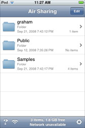
Although this works on Windows and Linux, I run OS X Leopard and Air Sharing allows me to connect to the computer (in my case a Mac Book Pro) using wifi and transfer files in the same way as if I were linking to another computer on the network. The iPod acts as a hard disk.
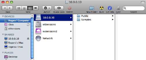
As installed on my iPod, there were two folders. The first was named Public which, without the password protection could be used as a cool way to share information. The other -- Samples -- had a selection of files to show the types of files that could be used and displayed.
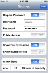
The screen will stay on while the iPod is attached, but we can set the iPod to sleep after a certain amount of inactivity. The default is ten minutes and that seems about right for most tasks. When I returned to it after wathcing a movie, the ipod was still shown as being connected, but the screen was off. I disconnected, then used the Go menu to make a new connection: a second or so, once the account name and password were entered. The real price of this gem is US$6.99 but for the first two weeks, they were giving it away free. Smart move. That gets it out and in the public domain so that people like me can rave about it. For the usefulness, this is going to be one of those must-haves although there is a psychological barrier here with the $6 and I feel $5.99 would place it better.
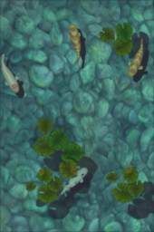
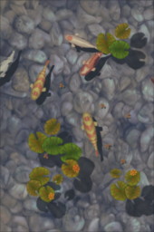
This is an extremely popular download by all accounts and so for its low price of $0.99 I decided to be rash and try this. Beautiful. Stunning graphics. This must have taken a lot of hard work. The concept is a fish pond that contains Koi, those graceful fish. When active, the screen becomes a virtual pond with a couple of plants and three of the fish. However, the touch screen is part of the charm and when we touch it the water ripples, and the fish will react if your finger is near. With speakers (or headphones) there is also sound with the water movement.
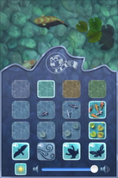
The information screen allows much tuning of the environment with the water colour, number of fish and plants and, if wanted, the sound of the wind as well. Sounds of other animals and birds can also be included. I ran this app for a day or so and made some more discoveries: the finger in the water was one of them. If the scren is touched close to the bottom an information icon (i) and a help (?) icon will appear. The latter told me about the finger action and also showed that if the iPod is shaken, food will drop into the water. This makes the fish more active as they swim for it. I am yet to discover if this is interactive in the way of the Tamagotchi toy, or even the Tigergotchi widget. In essence this is a totally useless applciation on one level; but it has such style that just looking at the screen gives a sense of relaxation -- this is why fish tanks feature so often in surgeries or hospital waiting rooms. I could look at this all day.
|
|

 Having downloaded the new iTunes and the latest 2.1 update for the iPod touch, I have been concentrating on the music. The new tricks with the Genius feature have again enlivened my music listening. I am not sure about all of the choices this feature makes, and worry that some tunes have been in all Genius lists. As much as I like Sting, listening to Soul Cages four times in one afternoon, did take the edge off things. But there have been some improvements over the first few days as the algorithm gets used to me and my selections.
 I rather like the app called
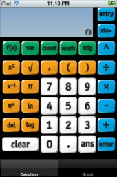
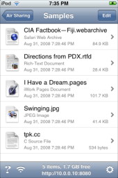
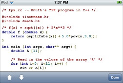 These were (from top to bottom): a web archive page, such as we might save when using Safari; a rich text (rtfd) file with an image; a page created in iWork Pages; a JPG, and a C source file. I was particularly impressed with this as this would allow sharing of code when a project was in development. The pages could be turned on the side and enlarged using the "pinch."