eXtensions
|
Aperture: The Digital Photographer's New Studio Tool |

I have been running Apple's digital workflow software, Aperture, for the last few weeks. It has changed my working methods with photographs. I dread returning the 17" MacBookPro it was installed on. It tries (and succeeds in the main) to capture the working environment of a photographers studio.
During that time, Apple and Canon took some time at the Paragon Studio, Siam Paragon to introduce the software to a wider audience on Saturday afternoon 29 July and bring along Jen Siow, a photographer from Kuala Lumpur. It was standing room only. There was useful information to be had, but I feel that local photographers with the skills to demonstrate to such an audience might be better appreciated.
For most people, until the last few years, cameras meant film; with the problems (and expense) of developing and printing. The professional photographer has often to work to a strict timescale. With a wedding, for example, pictures may need to be selected and sent to the guests the same day.
The wedding photographer is one of the Aperture-targeted groups, along with sports, wildlife and fashion photography, where getting the right shot means hundreds of discarded images.
With freedom from film, digital cameras bring a new problem: quantity. While film might have imposed some discipline on a photographer (simply through economics) being digital allows the luxury of almost-limitless shooting. One photographer recently admitted that while 1500 photographs may be usual for him, one special job produced over 3,000 images.
With film, that would have meant hours for processing, and then hours to sift and sort through the images to select the best for the customer, whether it be a newly married couple, a fashion magazine, advertising agency or National Geographic. For published work, a picture would then need further processing. The digital image circumvents much of this, but selection is paramount.

Aperture cuts through this process. Time-saving starts from the moment the camera is attached to the computer. The images in memory are displayed as soon as the card is recognised: a digital contact sheet folds out of the screen side, similar to how the Dock appears.
A photographer can select which images to download (or all of them) and they can be saved into a project folder. Unlike iPhoto and Adobe's Lightrooom beta, where downloading must be completed first, the instant an image is in the project, it is available to work on.

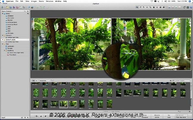
The Library, project folders and other organisation folders are displayed in a vertical bar to the left. Above this are selection tools for project and image management (e.g. folders and duplication).
The contents of the project are shown in a panel at the bottom of the screen and selected photographs are show in a window above. The sidebars and screen can be adjusted. With the 17" MacBookPro, selecting the entire contents of an album allowed me to examine 11 of the images, with a text message to indicate there were 31 more.
It was here that I began to see part of the sense of not putting this application on a computer like my own 12" PowerBook. The limited screen and graphics capabilities, could not take advantage of Aperture's strengths when making an image examination. What is needed is more viewing real estate, not less: a couple of cinema displays side by side would allow decisions to be made more easily.
Selecting one image at a time, I could move through them as fast as I was able to press the "right" button: within the limits of dexterity, that meant 52 images in under 5 seconds.
More practically, an image can be viewed quickly and decisions made on its value. If I downloaded ten images and one was out of focus, that can be seen immediately at this early stage and the image removed.
At this time images can also be rated using stars: zero to five. This is a menu item, but quickest is option+command plus the number. During the selection process (and at other times), a user may wish to examine the image closely. Aperture has a loupe function that works like a real one and not the simple enlarging tool of Lightroom. An image in the project window can have a tiny section enlarged as can images in the project panel below, thus making comparisons swift and easy.

At the bottom of the screen are buttons that allow viewing changes to be made: for example, full screen, rotate, rejections, and rating changes. Alongside, there are keyword selection tabs. A user may also add personalised keywords. These, plus the star ratings and other metadata assist in searching. If a library contains several thousand files, one may not be able to remember the exact location of specific images: search parameters help.
Tools such as straighten, crop, and red-eye are above the main viewing panel. Rotate is duplicated here: this is also in the panel below.

Note: a second part is now available online

For further information, e-mail to
Back to
eXtensions
To
eXtensions: 2004-05
To
eXtensions: Year Two
To
eXtensions: Year One
To
eXtensions: Book Reviews
Back to homepage