|
|
Readers might also want to refer to the five previous articles on Apps that I have written. Despite the reorganisation of the App Shop, a number of sites have begun to fill the breach, not least of which is the feed from Pinch Media which has given me a number of useful leads to new apps. This, and a couple of other sources have kept me better informed as someone else is now doing the legwork. Thanks to the feed, all I do is sit in front of my computer and scan through the list of apps as they appear and cherry pick. I have continued to restict most of my choices to free apps with the occasional app that I pay for. With the listings I am reading, I am also better able to compare the pricing and have been surprised in two ways: some are surprisingly cheap and some apps look to me to be priced higher than they may be worth, but only someone who needs an app would be able to judge that effectively.
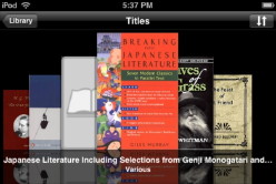
That old standby -- the restart -- did not bring this feature up. A further dig into the app found what I wanted. By touching the screen, an "i" will appear with other controls. That reveals information including a Cover Image and there are three ways to select: from the iPhoto images, from the book's own data, or from the web. I mangaged to retrive images for most and cover flow looks rather a nice way to view the titles. Of course, tap on the cover image and the book will open.
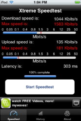
I need to confirm the caveat above concerning location. While I think this is a valuable app, the oddities that surround links to Thailand, mean that on occasions, I am not getting the best throughput. On the other hand, some of the figures (latency of 5536ms, for example) were useful ammunition when I wrote to the ISP this week. When Keith Olbermann's Countdown takes 11 hours, when it usually can some down in 60 minutes, there is something clearly wrong.
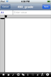
Well, I tried this and copied the XML code directly into a file that I name with an XML extension and still it let me down in NeoOffice and in the new Open Office 3 both of which recognise the XLS format. I don't -- I won't -- have Microsoft Office, so I have been unable to check if it works in there. Even if it did, this app has been a disappointment.
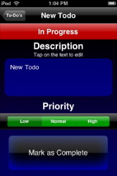
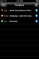
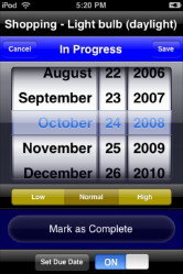
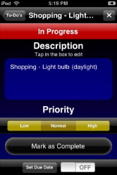
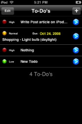
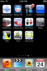
ToDo'sI found a new download in the form of ToDo's from BRFOS Studios, which has a nicer interface than the basic, but really useful To Do by Erica Sadun. When I downloaded it originally, it was free, but is now $0.99 so hardly breaks the bank. ToDos has a more sophisticated interface, allowing us to grade the importance of an event: low, normal, high. Oddly it is only those events with a high priority that show numbers on the Home Screen ToDo's icon.With Erica Sadun's app, this number (for all) is turned on or off in the touch settings section, but there is no way to adjust this in ToDo's. As a note here, I know it is a name, so it can be called whatever the devleoper decides, but the apostrophe is not a way to indicate a plural. I see this so much on the internet and it seems to have the same prevalence as "Alot" rather than "A lot". Back to ToDo's: When one adds a new event using the + icon (top right of the screen), a colourful panel opens. The main section has a description and tapping on this allows us to enter text and the keyboard appears. As neither this screen, nor any of the others in ToDo's uses the accelerometer, we have only the portrait screens to work on. First we have to delete the "New ToDo" text that is already there. Many apps have a litle cross in a grey circle t allow this, but ToDo's has a "Clear text" button at the top left. Pressing this, removes any text.
The main page lists any events and there are two basic controls: the plus (+) sign to add a new item and an Edit button. When this is pressed, a delete icon appears beside any entry except those marked as High Priority. The priority must be changed, or they must be marked as completed, before deletion can occur.
This is a useful little app although I would like to see all current entries shown on the Home Page icon, not just those that have the High classification. The interface is pleasant enough with white text on a black screen, although there may be too many colours used, particularly on the screen for entering data.
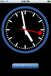
We have already mentioned "Digital Clock" which I see is now $0.99. A search of the App Store for digital clock shows another 28 apps that use time. What you will not see there, unsurprisingly, is Analog Clock from DS Effects, although if you click on that link, it will not give you any information about this app. Nor will the link to the Support site. Not, of course, that this should need much support. The screen displays a basic dial clock: hours and minutes wit white hands; seconds with a red hand. The markings on the dial are white and a blue halo surrounds the dial. Beneath the clock is a link to the website which is just as useful as the link from the iTMS: actually less so, as the page just gives a couple of entries and "Coming Soon." The clock is fine. More than fine: it does just what one expects, with no drama and clearly; and free. If a developer -- any developer -- wants to dig up business then one of the surest ways is a direct, working web link from app to site, with a mail link on the web page. Just a bit more work here. . . .
At university here, things get a little tougher, but old habits die hard. It is a task of much stick and some carrot to make students understand that they need to start with their own ideas (in itself a cultural minefield) and support these ideas with expert opinion. Wikipedia is banned in my department.
The app allows one to search for Open Access articles, so when I used search criteria in the search window at the top of the page that were engineering focussed, the list of search results changed that to articles that were centered on how the engineering term was used in health bulletins and articles. Nonetheless, my search for "wireless frequencies" revealed some 55 articles that were relevant. 10 shirt summaries were displayed on the page with access to the others via a simple click. Each entry in the list on page one had a small arrow to the right and pressing on the article data produced a full page with title, authors and abstract. One of those in my Wireless frequencies search that I examined at random, came from the IEEE (Institute of Electrical and Electronic Engineers) so may be directly relevant to research in my department. The list page and the abstract page can both be viewed in portrait or landscape view. At the bottom of the abstract display page is an "Email" button. Pressing this takes us directly to the iPod touch Mail app with the To: section already open and the keyboard displayed. From this panel, of course, we also have access to the Contacts so adding an email address is a matter of a couple of clicks. I sent mail to my Mobile Me account (hence also back to the iPod touch) and to a PPP account. It was easy to copy and paste text into another application (not from the touch of course). Pub Search costs $0.99 for the basic app, but there is a PubSearch Plus for $2.99 which gives access to more articles. believe me, if you need this, you need it and the price is nothing for the ease with which this can be done from your armchair, or even on a bus (if you are using the iPhone).
An English friend who turned up for me to look at his Mac just loved this one. In comarison with what we have in Bangkok, the Tube system in London is far more complex and because of that, its age and its integration into London's transport systems, it is important for travellers to know the status: no point turning up at the station to find there are no trains: early planning helps no end.
Each of London's Tube lines is named and colour coded, which makes it much easier when looking at the main map. New to me are a couple of terms here. I was aware of the Docklands Light Railway, which starts in the city and goes east, past the Docklands Airport, terminating near the largest sewage plant in Europe although you cannot see it from the station. What I did not know was the Overground which is the former Silverlink Metro line, a suburban route running through West, North and East London, so Transport for London tells me. Part of John Betjeman's Metroland. This is another app that has its page on the iTMS wrongly linked to "Local Host" bringing up the Apache web pages for my own computer. Fortunately, the Support link is written correctly and takes us to Malcolm Barclay's site. Also Tube London City $9.99 And Tube London $9.99 provide an interactive map-based way of looking at the city with links to several other types of information. The former uses the London Transport diagram of the network, while the latter superimposes the system on top of a street map. Tube News ($0.99) is a more colourful information service for the Tube with some extra data concerning platforms and times. London Tube ($3.99) provides similar information to Tube News but also factors in your location, which would be better suited to iPhone owners who are actually in London. Among the other extra ways information is disseminated here, there is a journey planner. There is also London Envi that might well be pefectly suited to thse visiting London with the way it offers data taken from Michael Brein's Guide to London by the Underground.
I see also that there is a Singapore Bus Guide. This is priced at $0.99. I am not sure I would want to pay $9.99 for the HK bus service data even if there is a search engine, time-table and bus fares can be calculated. It would also be useful if there were an English version. That is not entirely clear as on one place on the info panel Traditional Chinese is given as the language, while on another, it is English. All screen shots show Chinese characters only.
|
|

 Over the last couple of weeks, I have not only been playing with some new apps, but Apple's local PR office gave me an iPod nano and a second generation iPod touch to play with. The review on the touch should be in the Bangkok Post next week and I will add a link to this page then.
 This was slow to upload the first time and none of the covers I had were displayed. I will have to figure out a way to bring this up properly.



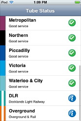
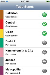
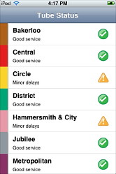
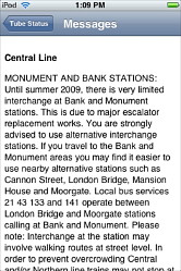 It is updated often as he status will obviously change during the day: a broken train at Euston Square will play havoc with services on the Circle Line and Hammersmith and City lines, for example.