Darkr for iOS: Nicely Done Emulations of Film - Cameras and Darkroom Techniques (Update)

eXtensions - Monday 19 December 2016
|
Darkr for iOS: Nicely Done Emulations of Film - Cameras and Darkroom Techniques (Update) |
 |
|
|
By Graham K. Rogers
Earlier this month, I looked at Filmborn an app that took up the idea of film techniques on the iPhone. Now Darkr is running with a similar film-emulating concept and the results are worth trying. I used the app on an iPhone 7 Plus.
DarkrThe app opens with a screen that has the main purpose of camera-type selection. Large Format, Medium Format and Small Format are shown as well as a Develop option that uses a film roll icon. The first of the two camera types are locked. This is a free app and has a single in-app purchase of 99 baht ($2.99) to unlock the Pro features. At the bottom of the opening panel there are also links to Tutorials, Release Notes, Settings and "Rate and Review". There is also a Contact button.

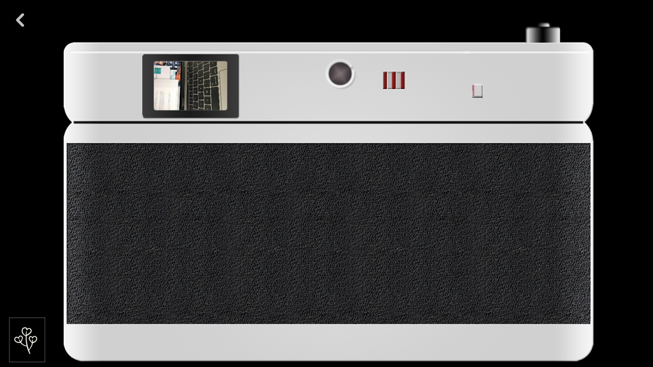
Darkr - Small Camera
Medium FormatAfter playing around with the Develop section for a while (see below), I was intrigued enough to look at the other cameras and selected the Medium one first: like my Hasselblad. A panel offered me the entire Pro package for the expected 99 baht ($2.99) or just the large camera for 35 baht ($0.99). There was also the Try for 1 hour option. As I believe that developers of good free apps should be rewarded, I bought the Pro package.
As the rings are rotated, the onscreen image is adjusted so the user can change the image to provide the best settings. With the Hasselblad I have to do this manually using input from a light meter. I was particularly impressed with the focussing ring in Darkr as the fine adjustments possible are conveyed to the image display right away so I was sure that the focus was right (up to a point of course). ISO settings run from 25 - 1600, while Time is from 4 (quarter second) up to a really fast 16000. As input options were adjusted, an indicator just below the square image display showed a green spot below a scale when settings were right, changing to red if the settings were one stop (or more) high or low. Even over- or under-exposed images have value in film. A white ring at bottom right was available as a camera button, but like the small camera, volume controls could be used.
Large FormatI do have a large format camera but have not used it (no lens or back), so the experience here had nothing I could compare to. An initial warning told me that the image would be upside down, the camera was only manual, but there was a loupe. For novices like myself there was also an Auto function, but I tried to avoid that.There are some similarities between this and the Medium format camera in that Time and ISO settings may be changed by the user, but the method is different. The specific setting is chosen and a single adjustment ring changes for that (ISO or Time). Like Medium a scale shows when the optimum settings are being used. Focus is adjusted when the loupe is selected. The rotating ring adjusts the part of the image within the loupe, which can be dragged to any part of the screen. Perspective can also be altered by dragging a finger across the screen: up and down; left and right. When these adjustments are used, small icons (for horizontal and vertical perspective) are available at the bottom of the screen to the left and right of the camera button. The image with this camera type, like the old format cameras the app emulates, is upside down, so greater care needs to be exercised, which is part of the charm of this app.
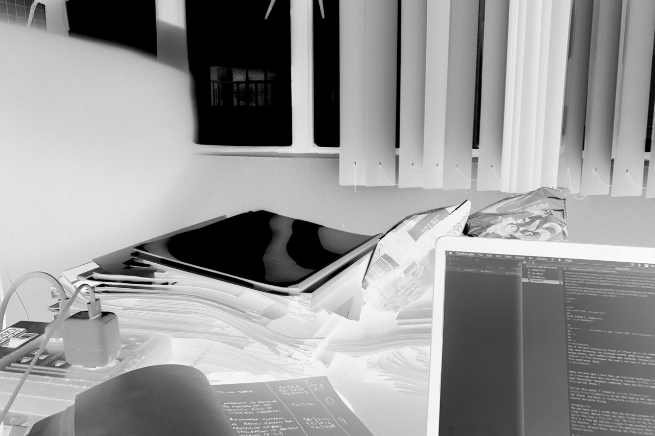
DevelopOnce images have been taken, the user can press on a tiny image display at the bottom left or return to the main screen to use Develop. The result appears to be the same: the user is informed that there are no developed images currently. Images shown are negatives. I had not seen this before.

Darkr - Negatives
When Darkroom is selected for the first time there is a brief tutorial that explains the workings of an enlarger and the importance of a test stip. By scrolling through the Test Strips offered - each of which has five options - the user is able to select the best output from the original image. Once this is done, editing tools (Base, Crop, Dodge, Burn, Blur, Tone) are made available as well as Layer. Some of the tools are only available in the Pro version, although there is an unusual "Try for 1 hour" option. Choosing a tool will also open a brief tutorial the first time it is used. The use of tools like Dodge and Burn takes a little learning (the tutorials definitely help) so there may not be perfect results instantly. The feeling I had was that the developers of the app understand photography. Once an image is developed, it is also available as a Print and can be exported in its edited form to social networking sites and to the Camera Roll.
CommentsThis unusual app is not an easy quick-snap photo solution, but Darkr is a delight to use for anyone with pretensions to understanding how photography works.The Settings item on the main screen has two options at the top: Show images from the camera-roll in color; and show the lightbox with white color. The default Intro screen when started can be changed to one of the camera types, or to show negatives first. Images exported to the camera roll were a little small, but acceptable, ranging from 1.2 MB to 1.6MB. These were all in JPEG format. All metadata, including location is stripped from the photo output. Larger images, perhaps RAW, and metadata, particularly location, are additions I would like to see. Although it works well on the iPhone, it is a universal app and loads perfectly on an iPad. I tried briefly on the 12.9" iPad Pro and the interface of the Small camera was massive. It was perhaps slightly better proportioned on the screen of the iPad Air 2, but on both, the interfaces of Large and Medium cameras - both with the ring adjusters - were set out differently. Once or twice on the iPhone the app stuck, for example in a Tutorial - and with the Small camera - I was unable to use the Back arrow. When I quit the app this was OK. I would hope that the problem would be found and fixed in a later update. I regard these pauses as minor in what is an unusual and enjoyable app that manages to push iPhone photography a little further. UpdateBy the morning after I wrote that, Darkr was updated to version 1.2 with a note, "Fixed a bug that sometime (sic) made the app crash when viewing images that came from iCloud". I have a lot of those of course. Good to see such a fat response to problems. Despite the relatively minor faults (try loading film on a Hasselblad on a moving train) my experiences with this app were positive. Darkr is highly recommended.
Graham K. Rogers teaches at the Faculty of Engineering, Mahidol University in Thailand. He wrote in the Bangkok Post, Database supplement on IT subjects. For the last seven years of Database he wrote a column on Apple and Macs. He is now continuing that in the Bangkok Post supplement, Life. He can be followed on Twitter (@extensions_th) |
|

For further information, e-mail to
Back to
eXtensions
Back to
Home Page