Another Interesting Photography App with Frames: Momentsia for iPad and iPhone

AMITIAE - Saturday 2 February 2013
|
Another Interesting Photography App with Frames: Momentsia for iPad and iPhone |
 |
|
|
By Graham K. Rogers
MomentsiaThere are a few apps that create photo collages, for example Diptic which offers several frame layouts that allow a different picture - from camera or library - to be used in each cell. Momentsia offers what appears to be similar frame layout options, although there are enough differences for this to stand on its own.When opened, after a tidy product screen the user is offered a screen with four cells. Each of these is filled with a bright colour. Below are five controls: a black X to clear the screen and start again; a colours button that changes the color contents of each cell; a cell design button; a black and white button that changes the positions of panels; and an Export button.
Initially, all the panels are filled with colours. These may be changed with the colours button or filled with images. Pressing a panel once, opens the camera and a photograph may be composed. Pressing it again takes the shot. Pressing and holding one of the panels accesses the Photo Library, so a previously taken image may be used. While taking photographs the controls for flash and front/rear camera are available. When the user has the panels and images set up, pressing the Export arrow gives a number of options: Photo Library, email, Instagram, Twitter and Facebook. I saved the images I made to the Photo Library and sent the same images by email as comparison. The fist time I sent an image by email (25 panels) I was given no options as to size. When I sent an image with fewer panels, there were three choices: small, medium and large - 45.3 KB, 124 KB and 475 KB.
While the app only displays in portrait mode, as the device (iPad or iPhone) is rotated, so the buttons turn and a collage can be created in a landcape form.

Output and Other CommentsThe types of output available will of course find some fans on social networking sites, but the unusual images that can be assembled in only a couple of minutes might also be usable in some publicity scenarios: for handouts or simple advertisements.The images transfered directly from the Photo Library of the iPhone were disappointingly small at 640 x 832 (0.5 MP) and just over 100 KB. The same images sent by email were 300 - 400 KB. I was surprised to find that an image created on the iPad and saved in the Photo Library had different dimensions at 1536 x 1920 (2.9 MP) with a file size of 337 KB. That same image sent by email had a file size of 840 KB and was also 1536 x 1920. When opened in Graphic Converter I had an image of about 21" x 27" which is fairly usable.
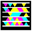
Although I like this app for the unusual output, its easy to understand controls and the way they work, I thought the name itself - Momentsia - was a little juvenile. The developer (Madbits) website is a little bare but gives an eye-catching example of the way such bright coloring can function.
Graham K. Rogers teaches at the Faculty of Engineering, Mahidol University in Thailand. He wrote in the Bangkok Post, Database supplement on IT subjects. For the last seven years of Database he wrote a column on Apple and Macs. |
|

For further information, e-mail to

|

|