TrueVisions App for iOS: Overkill; but Poor Attention to Details That Matter

AMITIAE - Tuesday 15 January 2013
|
TrueVisions App for iOS: Overkill; but Poor Attention to Details That Matter |
 |
|
|
By Graham K. Rogers
IntroductionI have been critical of True and its new super-thin TV Guide in the last few Cassandra columns, complaining initially about the thinness itself, and then about the reaction from customer service. I followed this with a reader comment on the TrueVisions App: a TV Guide for iOS. There were a couple of other comments in between.In the interests of fairness, I downloaded the app for a look. While there are some points about it that are usable, it may not suit all users for its general fussiness when it comes to registration. It worked, but the jumping through hoops that users have to go through may not be totally welcome. They seem to demonstrate the company's concern with control over the user experience. Many big names - Amazon, Apple, Citibank et al - have apps that do not require such levels of security even for online transactions. Heavens, this is only a TV guide.
BackgroundIf I watch TV, it is usually in the evening when (like a lot of people) I just want to relax: to "veg out". Occasionally, there is a rare good movie on (or a program I specifically want to watch). I used a print version of the TV guide to help make my plans. This was also useful on days when I stayed home. There is sometimes some good viewing during daylight hours too.At the beginning of the year there was a nasty surprise when the January version appeared. Instead of the usual listings for the day (24 hours), there was a mixed bag of channels for the evening only: a spread of about 3 or 4 hours. Day by day the order of those channels differed, so planning was not as easy as it might be, even with the limited time spread of programming. With the limited information now available, it would seem that there is an intent to drive customers to digital solutions, but not everyone wants to access information in this way. There is also the significant question of whether all TrueVision customers are actually owners of suitable devices. Just because I have and you have does not mean the family round the corner own such devices. If users do not have such access, they are now not being given enough programming information.
The reader's problems had begun when he tried to register, as information told him that the certificate for the server was invalid. When he contacted TrueVisions over this, he was told he was in error with his registration and he should do it again, ignoring the point about the server certificate report.
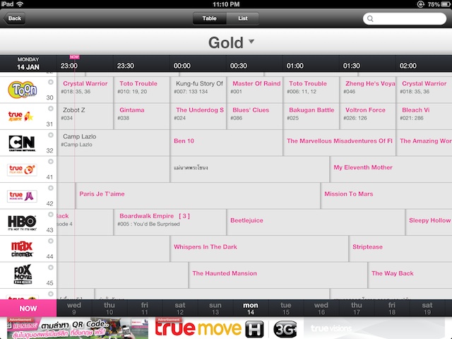
TrueVisions AppWhen I downloaded the app, it of course opened with Thai characters as the default, but this was easily changed in the settings, indicated by the universal gearwheel icon. Other sections available to me on the iPhone were: Highlights, TV Guide, Reminders, and Services. On the iPad there is also an icon marked, Magazine.Advertisements for future programs and for local products scrolled across the screen. On the iPhone the display is limited of course, and only works in portrait mode. On the iPad, both portrait and landscape modes are available. Highlights gave a display of panels showing some of the items viewers might like. Scrolling to the far left revealed a panel which would allow fine-tuning of selections with 8 categories shown. The default display was for Highlights, but a Favorites tab was shown. Sadly each time I selected this, the app crashed. The Listings section (TV Guide) showed all channels by default, but users may select the particular service (e.g. Gold or Silver) to limit the display. In landscape mode on the iPad 8 channels may be seen over a 3-hour time period. In portrait mode, there are more channels (13) but the time is shorter (2 hours). For the Gold service (which is what I subscribe to) there are 77 channels, if I counted right, some of which I never knew I had access to. At the bottom of the screen is a date display so it is possible to look forward (4 weeks) and back (7 days). There was a small delay while data was downloaded. Tapping on one of the program boxes in the listing, brought up fuller details for many. Some only showed viewing times, while others provided full information including a synopsis. It was also possible with the program display to add an item as a favorite.
A thin bar indicated the current time so it was easy to see what was on TV at the time of the search, but the large number of channels available meant that a user would need to keep scrolling up and down the screen to be able to plan a schedule. This was much easier done with the few channels in the paper guide. I now have more data than is manageable of course and while the intent may have been to assist customers, while reducing costs of print and distribution, the digital world may not always be the best solution for a particular problem.

RegistrationWhile the TV Guide is useable, as some services need a registration and the user problems (above) concerned registration too, I decided to try this (albeit reluctantly). This is in three parts and demonstrates a degree of control that True seems to want to exercise over all of its services. This is a TV guide, not the national archives.Part one of the registration has three options: registered preference number, True Visions account number, or smart card number. A little more information about each of these was on that digital form.
The final part is an option. Register for the service and we go Green: no more print. While I am all for a reduction in the number of trees cut down - particularly in this part of the world where the authorities seem to be powerless (or in cahoots) to stop this destruction - the idea of the term "Green" tends to be overdone: as if it is some magic spell. I left this checked although did make sure that it could be unchecked. I am unable to confirm if the registration fails in this case.
The screen first reported that my phone number was not entered. True already has this, so I am unsure why they think they need it again, but in re-entering some data I may have deleted this. I tapped in the details once more. The screen then reported that the True ID was wrong. Following the initial instructions, I had found a bill and copied the number - digit by digit - into the space provided. I double-checked and sent the form again. Once more a refusal. After the third time, I gave up; but then I saw that an email had arrived from True asking me to click for verification. When that was done another message arrived confirming my details.

and . . .

The result is posters that look stupid and we all laugh at them; while some come to me after journal papers have been rejected because of English problems: then I am expected to wave a magic wand.
CommentsMuch to my surprise (despite my lack of confidence following the registration), when I tried the login using the app on my iPhone, it worked first time. I am at a loss, however, to see any major value to me as a user, apart from information (when the server responds), but which I could obtain by phoning a Helpdesk operator or visiting an outlet in a mall.The app has a certain value in that full scheduling is now available to me, but for most users the waste of time that registration entails outweighs what they might get out of it. What the company gets out of the customer data may be something else: data being a valuable resource. For now, it may be just as useful if users skip registration and learn to use the time displays to make their own schedules.
Systems serve the user. The customer is not there to serve IT.
Graham K. Rogers teaches at the Faculty of Engineering, Mahidol University in Thailand. He wrote in the Bangkok Post, Database supplement on IT subjects. For the last seven years of Database he wrote a column on Apple and Macs. |
|

For further information, e-mail to

|

|