Architecture of Radio: iOS App for Mapping Signals that Surround us - WiFi, Cell Towers and Satellites (Amended)
AMITIAE - Friday 20 November 2015
|
Architecture of Radio: iOS App for Mapping Signals that Surround us - WiFi, Cell Towers and Satellites (Amended) |
|
|
|
By Graham K. Rogers
The idea of mapping signals is not new. A colleague at work has written a number of papers on signal strength for telephone systems here. He drags spectrum analysers about on a cart and examines variations in signals in areas with trees, inside buildings and in car parks with or without lots of cars. One of the key words is attenuation: signals drop in certain places (try your bathroom). The mathematics is rather complex, but in the end users like me may find that our mobile phone signals are better. There are similar apps for iOS and one app that has been in development for a while was released this week. I have been trying The Architecture of Radio ($2.99) on a couple of iPhones and my iPad. It provides a display of some of the signals that surround us, from Wi-Fi, cellular towers and satellites. The results are as surprising as they are interesting. This early release is shown as version 0.4.
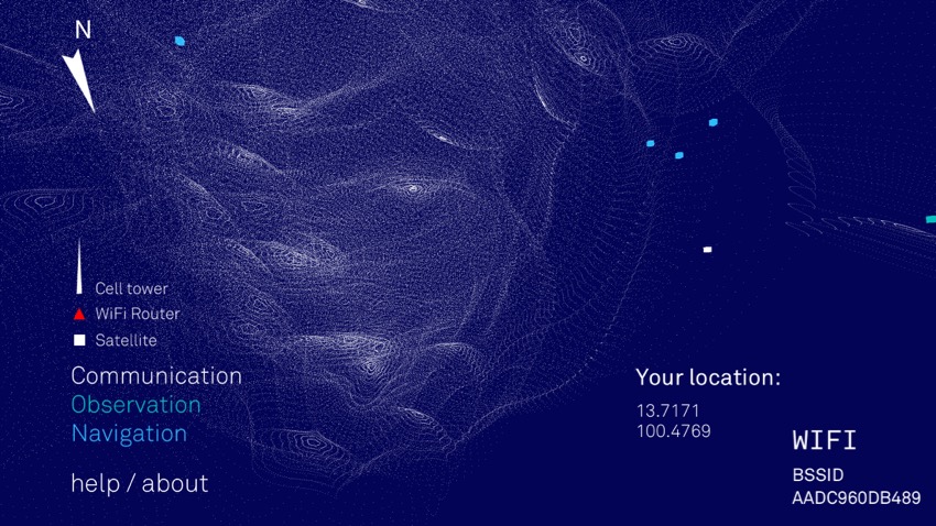

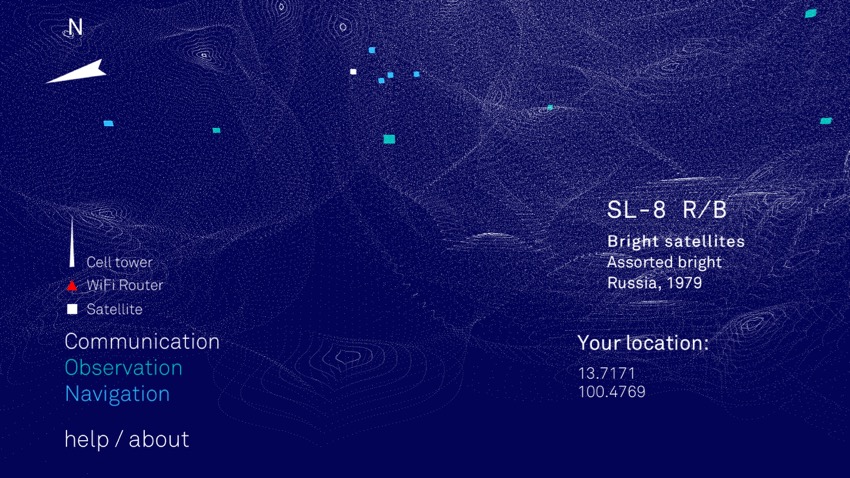
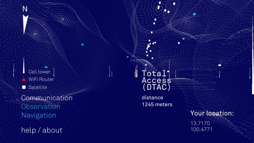
As well as the WiFi I have, a number of WiFi units were indicated when I moved to a window. None of these was named by the app, although the height of the triangle would seem to indicate signal strength. Due to our location in Thailand, close to the Clarke belt, there were satellites shown whichever direction I pointed the rear of the iPhone in. With these, the country or region operating the satellite was given (Russia, France, USA, Japan and Europe). The purpose (e.g. GPS) was given in some cases along with the satellite name (Intelsat, Prometheus, Iridium, CXO, Ariane, Cosmos). The satellite icons were colour-coded: white for communication; green for observation; and blue for navigation. While the app was in use there was a constant background noise which sounded similar to a Geiger counter. I could find no way to turn this off apart from using the iPhone volume controls.

A single gesture is available: by placing one finger on the screen at or near its center, an option becomes available for taking a screen shot. I found it just as easy to use the built-in iOS method of Home and Off buttons.
Graham K. Rogers teaches at the Faculty of Engineering, Mahidol University in Thailand. He wrote in the Bangkok Post, Database supplement on IT subjects. For the last seven years of Database he wrote a column on Apple and Macs. He is now continuing that in the Bangkok Post supplement, Life. |
|

For further information, e-mail to
Back to
eXtensions
Back to
Home Page