Ampersands the App: Character or Art?
AMITIAE - Wednesday 9 July 2014
|
Ampersands the App: Character or Art? |
|
|
|
By Graham K. Rogers
In a similar way, Ampersands, is dedicated to calligraphy: the visual art of creating letters. The rewritten text of the article is available below, with an additional image. Those interested might note that Ampersands is still available and has not been updated since its first release: but why spoil something that worked the first time?
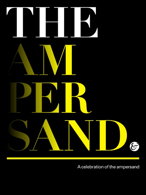
To an extent the Ampersand has become the forgotten letter of the alphabet. Few ever knew what to do with it apart from special uses. I could never write it (I still cannot), but use it with HTML code for special characters like é which starts with the & and ends with a semi-colon. It is also useful in Twitter, used in place of "and" - it saves 2 characters. One would think that it has been assigned a life of obscurity. However, there has been an odd appearance online of an iPad-only app, Ampersands that celebrates this character. Produced by Chris Gregory, of Inddtraining of London, this free app, displays a selection of Ampersands in various fonts - each full screen. There are 25 in all and each has the name of the font and the original designer in small type at the bottom.
It is a delightful and completely useless app: In that we should celebrate the app for its own artistic sake and the iPad that gives the freedom to experiment with such forms of publication that would otherwise be lost to us. And let me qualify that, "completely useless," because this is what Art is in many ways: fashioned from nothing to keep a drowsy emperor awake. More than this, however, is the importance in some design circles of the need to examine and be aware of typography. As may be seen with Yoon Park's Typography Insight app this is important. Having examined the résumés of hundreds of students over the years, many more should take the time to understand what effect the right font can have: or the wrong one.
Graham K. Rogers teaches at the Faculty of Engineering, Mahidol University in Thailand where he is also Assistant Dean. He wrote in the Bangkok Post, Database supplement on IT subjects. For the last seven years of Database he wrote a column on Apple and Macs. He is now continuing that in the Bangkok Post supplement, Life. |
|

For further information, e-mail to
|
|

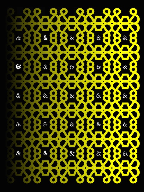
 The screen-shots on the App Store show an intricate image with inserted ampersands: it would be nice to see more of these. The image showed when I first opened the app but was lost to me from then on, not appearing even in the menu system. However, in a later version of iOS, by removing the app from the time-line and reopening, this now appears, albeit only for a moment, but I was able to take a screen shot (above).