Dorna Sports - MotoGP Full Experience: Snatching a Defeat from the Jaws of Victory
AMITIAE - Saturday 7 April 2012
|
Dorna Sports - MotoGP Full Experience: Snatching a Defeat from the Jaws of Victory |
|
|
|
By Graham K. Rogers
The app, now called MotoGP Live Experience Full (itself a mouthful) seems over-designed, with a limited feature set. I cannot help but compare it to the Soft Pauer Moto GP apps as I had been using them for the last couple of years. They also used the same data: from Dorna Sports. Soft Pauer had given users an app that not only did the job but provided a considerable amount of extra information. This app has considerably reduced content and for a slightly higher price at $24.99. It comes up short in almost every way.
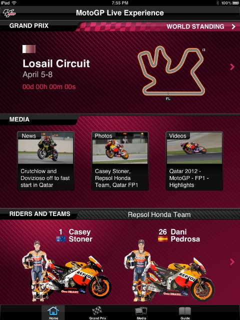
As the season is just starting there are no results yet available, but the World Standings section is set up to display data for the three classes.
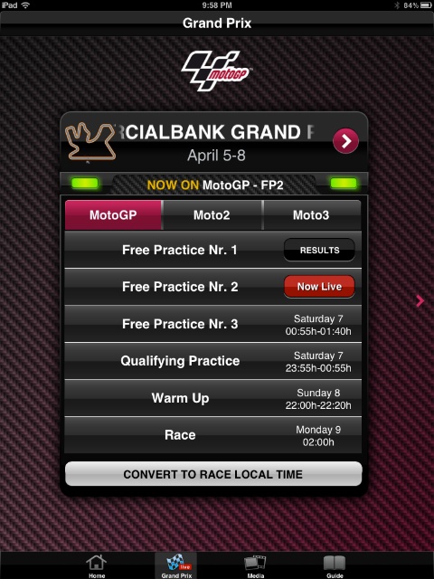
Timing is the KeyTapping on the circuit, in the Grand Prix section close to the top of the screen, brings up a small panel that allows the user to select any one of the practice sessions or race, for each of the three classes. A live session is indicated by a red button to the right of the panel entry. As long as a user knows when these are due -- there are no notifications in this app -- the link to the timing screens is immediate.The circuit panels can be scrolled right (or left) to reveal the next (or previous) race. When a session is live, tapping the item opens a full screen with timing and a circuit map. The display can be adjusted to display only the timing screen or only the circuit. As the bikes circulate, transponders pick up the position giving location and timing data.
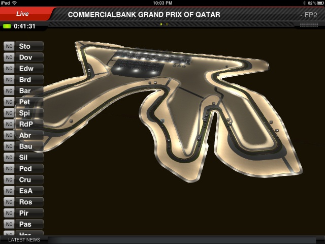
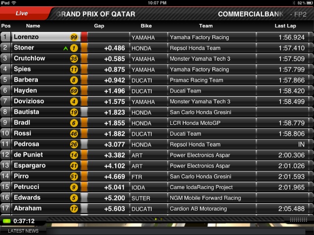
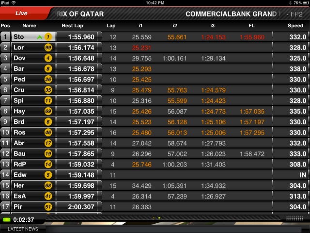
The display colours are not as they have been in previous years. Before, the fastest times and a rider's best times (lap or sector) were color-coded (purple, green, yellow or white) this is now no longer the case. A faded white is used for a standard time, with ocher shown occasionally. Times in red now indicate the fastest. A green single chevron was shown once in a while which I presume was a rider's best time, but it vanished fairly quickly. I also had problems with understanding lap times. With three intermediate sections, the total lap time (e.g. 1:57.787) should be the sum of the three sectors: 1:25.329 + 56.202 + 25.636. It appears that instead these may be progressive times, which I find confusing, but there is no way I found to change this.
There are no post-practice data downloads. With the Soft-Pauer app, within minutes of any session (or race) ending, the whole was available as a download and a user could run it again, including the circuit views. This was useful for an enthusiast like me, especially if it was a race held overnight that I was unable to watch on TV: I need to sleep too.
Media -- A Diluted MessageThe Media section shows thumbnails for News, Photos and Videos. The same information is available when the Media icon at the bottom of the screen is pressed: Videos, Photos and News. As well as the different order, content is different. In the main panel, currently, there is a single video of 1:32 showing the practice session. From the media icon, a diagram of the circuit is shown. Tapping that gave me two videos for MotoGP: a preview and the same free practice 1 clip. There were no videos for Moto2 or Moto3. I would expect that the video collection would build as the season develops, but the lack of input for the lesser classes is worrying.From the main screen, the Photo section displayed one image. Accessing via the Media icon gave me a number of photographs for each of the three classes. Likewise, News had far more stories when the Media icon at the bottom of the screen was used. Unless there is to be a major change, access to media via the main screen seems to have a significant amount of redundancy.
Another feature missing is the access to race commentaries from Nick Harris and his team, although this may be due to the way the rights in Europe have been changed with the BBC now handling some of the output: again, less for more.
Limited Guide InformationThe last icon at the bottom of the screen is marked Guide and there are several panels shown, each of which can be tapped for more information: Riders and Teams; What is MotoGP?; What is Moto2?; What is Moto3?; Video (a 3-minute background video); The Championship (half page text); Flags and Lights; Qualifying (text); Race (full page text); and Points, explaining how these are awarded.The first section here (Riders and teams) is split into the 3 classes with a list of teams and the riders. Tapping on any rider's name brought up a screen with images and limited biographical information.
CommentsDorna have taken the good idea of using the timing screen data, that had been executed fairly well in the last couple of years by another developer, and spoiled it with over-design, gaudy colours, poor fonts, fewer options for display, no notifications, no settings, no options and no commentary.As each rider ended a session, so a flag by his name changed to a chequered icon: a degree of sophistication within the app that is indicative of what is wrong. There is too much concentration on icing, with not enough thought to the "cake" beneath. I am unable to hide my disappointment with this app which I examined mainly on the iPad2. It did actually look a little better on the iPhone, but the smaller screen may have concealed rather than enhanced. While I have only looked at the app while free practice sessions are running so far, I will run it over the rest of the weekend and amend this review if there are any noteworthy differences during the upcoming sessions and the race.
If there were a way, I would ask for my money back. I would love to see the contract returned to Soft Pauer for next year (or even this year) in the hope that they might be able to resurrect something out of the ashes.
Graham K. Rogers teaches at the Faculty of Engineering, Mahidol University in Thailand. He wrote in the Bangkok Post, Database supplement on IT subjects. For the last seven years of Database he wrote a column on Apple and Macs. |
|

For further information, e-mail to

|

|